Choosing the Color Palette
Why the palette is built around Bergen’s weather and Bryggen’s colors.
When I was putting together the initial color theme for my personal site. My primary concern was finding something that had some kind of personal connection to me, or where I’m from.
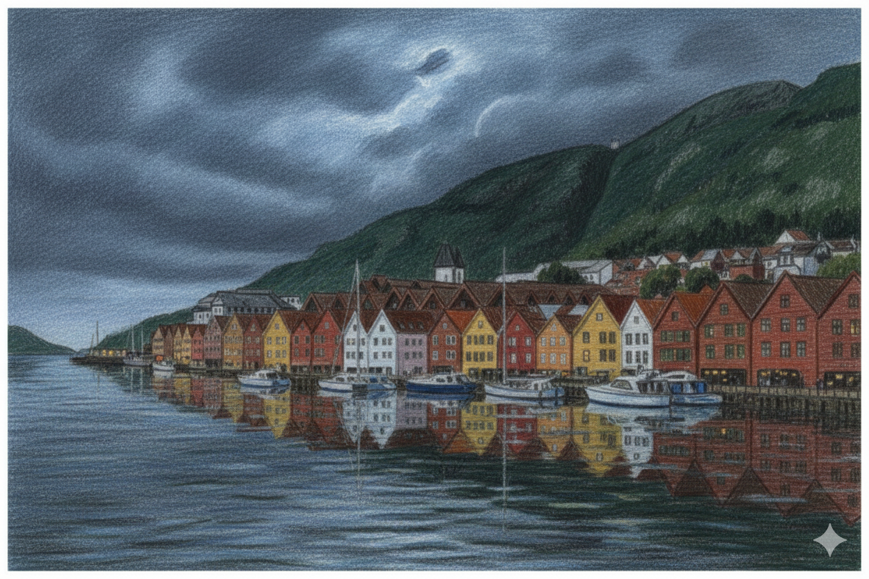
To get there, I actually used quite a few pictures and paintings of Bryggen and the Bergen mountains. And combined with my own instruction on weather and colors, went a bunch of iterations until I had a picture that felt like how I see Bergen, at least most of the time, in my own mind.
But the point of the image was really just as a point of reference to create the color palette you see. A dark, stormy background , green of moss and heavy trees , the brownish red and ochre of the famous city center waterfront.
I ended on what you see in the default, darkmode setting right now. Dark blues on the background. rgb(15, 26, 34) .
cards and other elevated surfaces, only slightly lighter, with a bit more green, heavy, rainy, dark. rgb(21, 35, 46)
And then we get the characteristic Bryggen-red accents. Here, I had to mute the colors a little bit, to not slide into error-red. But I think I landed on a pretty nice, clear “Bryggen in the fall” red with rgb(140, 63, 50) and most of the headers in ochre with rgb(176, 154, 99)
The light mode, is still a work in progress. but I want it to be a love-letter to Bergen in spring. How lush, green, and glitteringly bright the city can be. Maybe sneaking in the cherry blossoms falling.